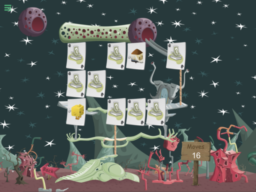
Memories of Ur is a card matching game featuring graphics from the old online game GLITCH.
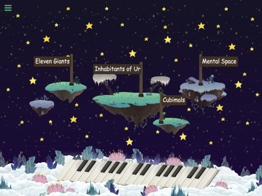
- four themes for card decks: the Eleven Giants, Inhabitants of Ur, Cubimals, and Mental Space.
- eleven layouts for each theme (44 layouts in all) ranging from easy (16 cards) to difficult (40 cards). NOTE: only the first 5 layouts for each theme are currently available.
- best accuracy score saved for each layout.
- music by mJc
- thanks to Tiny Speck for releasing the assets from GLITCH into the public domain.


YOU MUST BE SIGNED IN TO LEAVE A COMMENT
June 21, 2016
Nice Update. I like the changes :). One small thing I'd add is being able to skip the intro. Maybe after a second show a skip button or something. It gets a bit annoying having to sit through it each time. Cool the first couple of times, but after that I just want to play!.
June 11, 2016
Great work! Very polished project.
Any ways, awesome work :)
June 12, 2016
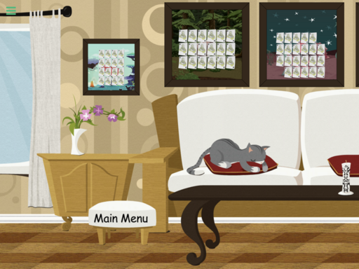
Thanks Murtaza. I have a list of little interactive "surprises" that I want to add, including tap the cat and it purrs. I like your idea with the piano. The keys may be a bit too small to play, but maybe have different sections of the keyboard play different tunes. Should I put a swipe indicator on the menu pages so people know they can swipe to see more options?
June 12, 2016
Hmm, what you can do instead of an indicator, is start it all the way on the right (or partially if it's too long), and just pan over. This way the user can sort of get the idea that theres more.
June 13, 2016
Good idea, I'll add that in the next update. Thanks.