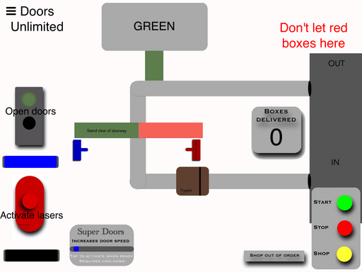
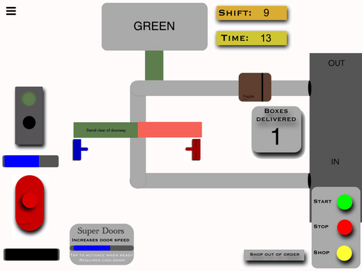
Door Unlimited is an endless game.
Hold down the sort of traffic light button to open the doors and let brown and green boxes pass through.
Hold down the red button to activate the lasers to destroy the red boxes that may contain illegal products!


PROJECT DESCRIPTION
Share this project:
VERSION 1.4
Last Updated: September 21, 2022
Complete redesign!
New game over/menu screen. If you lose you also return to this screen.
New Shifts system! Each shift is a new level, adding on another second each time.
New graphics and other changes.
Set up the Coins system. Unfortunately, you can't spend them on anything yet.


YOU MUST BE SIGNED IN TO LEAVE A COMMENT
March 02, 2016
Just played the new version. Like I said this game has the potential to be really fun! But you just need to get the game easier to play and understand... With out using text.
Your tutorial is not very helpful By the end of it, the player still has no actual idea on how to play your game. (I handed it to someone who hasn't payed to test).
March 01, 2016
Let me know if the new update starts you on shift 10 or anything higher than 1. It's my first time using the "Save" and "Load Files."
March 01, 2016
It starts you on 1 but the shifts still progress if you make a mistake. I love the new update! :)
March 01, 2016
Even if the timer doesn't reach 0 and you lose, it progresses?
March 01, 2016
Yes, exactly. It happened to me a few times.
March 01, 2016
Hm.. It doesn't happen to me... Does it happen ALL the time? Sometimes the timer can reach 0, and if you lose before it transfers you back to the menu it still counts as a win.
I'm also looking for any shop item ideas. What would you buy if there was a shop?
March 01, 2016
I always suggest making like upgrades instead of or in addition to skins because I never got the point of that. If you could make certain power-up upgrades where you achieve things and earn double what you should earn you'll definitely have a nice little shop. Also, it happened to me every time :(
March 01, 2016
Ugh. I'll fix the problem. And I actually agree with the upgrades now that I think of it. Thanks.
March 01, 2016
Do you mind giving me a little bit of information? At any time of a shift, even the very start, if you lose, you progress to the next shift? You move from (for example) shift 2 to shift 3? Do you also gain any Coins? After you progress, does the timer increase? After each shift, the time should increase. I'm baffled.
March 01, 2016
Everything's working fine except the fact that the shifts progress even if you do the wrong thing. The time is increasing with the shift. I'm pretty sure you don't get the coins if you don't pass it. I don't know how you set everything up, and I can't exactly tell, but this is what it seems like. Hopefully I'm not miscalculating with the coins.
March 01, 2016
The amount of coins you have should be the same as the number shift you're on. The only thing I can say is to restart Hyperpad, or perhaps your whole device if it comes to that. If not, I'll update the game again. Maybe you didn't recieve all of the updated features? I'll also ask an admin what's happening. Thanks, again! :)
March 01, 2016
Wait, wait! It worked, I'm just saying I could've made a mistake. I might've just not noticed the coins. Give me a second, okay?
March 01, 2016
Lol I'm blind. Yes, they're the same as the shift that I'm on. They're both "malfunctioning" together :)
March 01, 2016
So it's not working, right?
March 02, 2016
Well they're just both progressing no matter what, and that's basically it.
February 29, 2016
The colors are very confusing. I'm having trouble understanding which color is which. I think this is because you should provide examples and work around the wordy instructions. Then you could provide nice visuals so if anyone is having a different problem, or my problem, it's gone.
Also, everything is very disorganized. Everything was all scattered on 1 screen, and it was sort of overwhelming to the eye. If you organize things with icons or buttons and a title screen with many seperate overlays and screens, it seems more professional, is easier on the eye and brain, and gives off the impression that you have more than you have.
I like the concept. Please keep adding more. I think you should make a storyline, nice flowing music, and a bunch of levels. You could keep the infinite mode as another option, but I really think that should be your main focus. If you can come up with another mode and surprise me, I'd be really impressed and you could publish to the App Store and make some nice bucks. Keep at it. I'm looking forward to seeing more! :)
February 29, 2016
Thanks. I'm the update I'm about to submit, it provides a little interactive tutorial. In the game over screen, tap "Tutorial" to start it.
One thing I wanted was for players to feel like they were working some sort of factory, but obviously know what they're doing. I feel like once players do the tutorial and play a little, they could memorize what they need to do and when. Make them feel like experts. Hopefully the tutorial makes it a bit less complex. Otherwise, I'll keep searching for ways to improve it.
I'm thinking of adding some nice background music, and cool sounds to indicate different events.
As for a story and endless mode, I really would like to combine them. Sort of like an endless, progressively harder game. As the level increases, as Murtaza said, your life's decrease and the amount of time increases, making it harder. And finally, once that's all done, I'm planning on adding a neat little shop to customize your factory. But for a story, I'm not sure what it would be about....
March 01, 2016
I'm thinking the story should be silly and quite simple. I published a beta version of my game two months ago with a story about a slime and his enemy water who washed him away to the land of dirt. If you could come up with a small and simple graphical story about like a factory or something, and you remember to remind the player now and then, there you have it!
February 29, 2016
Got a chance to play this today. It's a cool concept, and pretty fun game. However, your interface is very very confusing!
Even though the gameplay is really simple, it took me a few minutes to figure out what's going on. There is too many things on screen, and too much stuff happening too quickly, with very little feedback.
Your game starts immediately with out any warning. Then I'm hurled in an interface with buttons that I don't have enough time to try and figure things out. You don't let me actually explore the options and what they do. There are labels for a bout 1 second, but they are hard to read, and I'm distracted by the first box before I get a chance to notice them.
The Stat/stop/shop buttons.. They're another distraction. I kept pressing them thinking thats what I was supposed to use to play the game. Only after dying a few times did I realize they are a sort of pause system.
When your box collides with the edge of the door, it takes a few seconds for it to lose, until it passes the green spot. It should lose much quicker, because every time Is think I still have a chance since it only hit the edges a little bit.
I don't think I should get game over after 1 missed box. Maybe have a certain number of boxes you're allowed to miss, and make it progressively get harder (level based?).
I would make the game work off levels instead, and have a timer for how long the level lasts (and how many you need to deliver). Make it like a real factory job, there's a shift where you have and you have to work, and you have to do a good job. Make level one relatively easy, it's your first shift. Let me miss a few boxes. Then each level lower the amount I'm allowed to miss, and decrease the time.. You can also make other little advances like add more doors, different colours have to do different things.. It could get really fun and really intense!
I really like the concept, but I think you should start with making it easier to understand, and easier for a first time player to start playing.You want it easy to play, but hard to master.
February 29, 2016
I agree. I was still wondering where I would go with this. I'm making a sort of diagram as a tutorial. Also, the game over screen explains what you have to do, and the screenshot on this game includes the help text, so you can take all the time you need to read it. However, it should be included in the game. I'll finish the game and how it progresses before adding things like shops and special power ups.
February 29, 2016
I always think text and instructions are a bad way of doing things. You want to teach the user by having them actually play your game. Force them to make mistakes, but learn from them.. Show them what's possible, and make them want to do it to.
There are a lot of ways you can do this. One example, is create a menu scene, and your game running by it self in the back ground. Subconsciously, the user is learning how to play your game. Another way, simply have the game play a few seconds by it self when it starts, then do a count down time when it's the users turn.
You could also do things like stop the game when the box reaches the correct point, and flash the door button, or show arrows.. basically force the player to actually do that before the game continues.
Manuals, labels, instructions, no one every reads those. People just want to start doing things right away!
February 28, 2016
If you didn't have enough time to read the help text in the beginning, look at the screenshot, it shows the whole layout including the help text.
February 29, 2016
I'd also appreciate some feedback....