Update! New location set up,the letters are replaced with graphics for a nicer finish,still trying stuff to make it nicer looking.
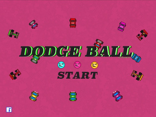
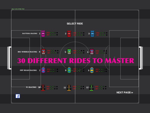
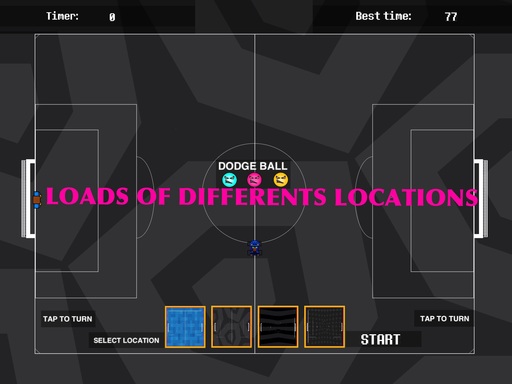
Fun game of dodge ball,loads of rides to master and loads of locations to tryout,theres something for everyone.
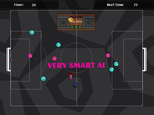
Cool 8 bit music,brilliant graphics,brilliant driving physics and advanced AI.
2 different leaderboards to master.
If you want a certain type of vehicle leave a comment below.
Please leave a bug report in the comments if you find one.
Please rate the game fairly and thanks for playing.
PROJECT DESCRIPTION
Share this project:
VERSION 1.0
Last Updated: September 21, 2022

YOU MUST BE SIGNED IN TO LEAVE A COMMENT
August 10, 2016
The first game
August 06, 2016
Are you still on hyperpad? Haven't seen you on in a while.
October 14, 2016
Yes im still here,so busy with work,hard to find time to create a game,I have a new game idea that I will start when I find the time.alot has changed with hyperpad,so I will have to teach myself how to use some stuff again.
October 14, 2016
Ok cool!
February 20, 2016
Did you use the move behaviors or did you use physics things like apply force? Did you use sine and cosine?
October 13, 2015
By the way...in the car selecting scene, your select ride text moves to different spots when you go the the different pages.
October 13, 2015
Thanks for pointing that out,when I'm working on that game again I'll fix that.
October 13, 2015
No problem...I figured that was the case, but I thought it was worth asking😜 I understand😎
October 13, 2015
Could you give some tips on how to make this..I want to make a racing game...I'm mostly curious about what behaviors you use for the car to drive
October 13, 2015
To be honest I'm not ready to give away my trick yet on how to do that,it took me longer than you think to come up with that,and it seem rare in games on game press and hyper pad,and i have plans on using the same behaviours in other games also.sorry I feel like a Dutchbag not telling you.
October 12, 2015
This is my favorite game on the hub!!!!
October 13, 2015
Thanks aLot:)
September 29, 2015
cool game.
September 29, 2015
Thank you
September 28, 2015
"full screen window with 1 car at a time, and the stats more clearly displayed. Then a next/previous button to cycle to the next car. Have a single button that says "Select Car" or something." I agree with Murtaza, but also I've noticed that a lot of the cars are just the same but a different color. Add a color selection, for example: I pick Car A, and I have the ability to chose between options 1, 2, and 3 for colors.
Other than that, I don't really have anything else to say that hasn't been pointed out already by Abel, TranquilityGames, and Murtaza. Keep up the good work with this game, Dom!
September 28, 2015
Thanks for your review.
August 24, 2015
Really nice, I can clearly see that you've put a lot of time and effort into making this game unique, smooth, replay-able and polished.
Pros: lots of cars to choose from, nice music, effortless controls, smooth drifting, smart AI, many locations and good graphics.
Cons: confusing layout, weird gameplay; I didn't understand why there were different coloured balls, thought I'd be able to rebound some, didn't get the point of the game; I thought it'd actually be a game of dodgeball, also didn't get the point of the goals - did I miss something? Because, the game doesn't actually explain what the objective of the game is - perhaps add a small text explaining what to do before it starts, I don't know, it just isn't thoroughly explained to the user.
Other than that, really good job. I'm really impressed by the great games already submitted to the Hyperpad Hub.
August 24, 2015
Thanks for your review,I did put a lot of time into this game,the music in all my games is purchased with real money.in terms of layout and describing my games that seems to be a issue,I'm still learning,and hopefully will get better at that.there will be more updates to this game in the future.
September 29, 2015
hey dom how can i have a username for the game just incase i make it to the leader board?
September 29, 2015
hey dom how can i have a username for the game just incase i make it to the leader board?
June 20, 2015
On your start screen right before the gameplay when you tap/press to turn, the object is activated. I saw you added some kind of structure? To hold it in place from moving. On suggestion for that as an alternative is add an empty object with a started touching behavior between the buttons for the movement & the start/choose background button. Then once you have started touching start destroy that empty object. This will prevent the buttons from moving the car before starting, but the empty object will have to be stretched by around 1700 and 900, but just a suggestion.
June 20, 2015
Thanks for pointing that out,the issue is fixed now.
June 19, 2015
Thanks for the tips,there's an upgrade on the way tonight,I'll try add all your ideas.
June 19, 2015
I really like the car control! Very smooth, and really easy to drift and feel like your good.
My feedback: -I didn't know what to do. Even though the game is called dodgeball, it didn't click in my mind to dodge the balls. Maybe make this a bit more clear on what I'm supposed to do. And make that part of the game it self. One idea is to have the game start, give some sort of notification that the ball is going to come. and shoot one ball. If it hits me, give me some sort of second chance, but still make it clear that I should avoid those. Basically introduce the gameplay element, without punishing me right away. Also maybe move the "Tap to Turn" instructions into the game. So when you press Start that's when they show up. And maybe make it sort of animated. Similar concept to Abel's Rush Jump. It tells you to tap once the game starts. It will clear up your start screen and make it easier to start.
-Kind of hard. I don't like how you loose right when crashing the first time. I touch on this in my first point. Some ideas could be adding a shield power-up, a health gauge (for 2 shots?) or something along those lines. You don't want to make it too easy, but at the same time you don't want it too hard.
I didn't understand why the balls are changing colour. At first I thought that meant I could bounce them away or something.
The Car select screen is information overload. This may be too much, but why not make it a full screen window with 1 car at a time, and the stats more clearly displayed. Then a next/previous button to cycle to the next car. Have a single button that says "Select Car" or something. This simplifies it, and makes the game feel really polished.
-I really like the style of your main "Start Game" screen, you should carry this same style throughout the entire game. Make all buttons and text this same style. Use the "8bit font" only for text that needs to constantly change (like scores).
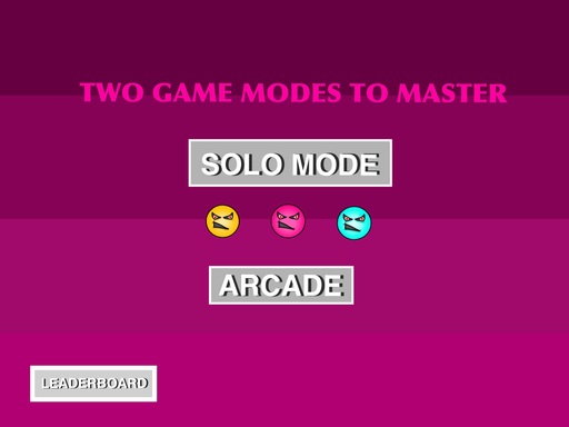
-The select location, start, and arcade mode screen is kind of confusing. I wouldn't even have arcade mode part of this screen. I would make a main menu instead of just having "Start" make it a menu to choose your game type. Standard or Arcade.
-For select location, instead of A, B, C, put some thumbnail pictures along the bottom. Then when you tap each one, it changes the background image. It will be more visual, and could look really cool.
Overall a really good base, just a few things to make it really polished :).
June 18, 2015
Cool! I drifted several times